

Pimp my slide
Represented
- Length788 words 9 images
- Reading Time4 min 7 sec
- Create
Engineer
Advise60%
10%
40%
- Introduction
- Letting images speak
- Using the CI
- Explaining step by step
- Processing purposefully
- Being specific
- Too long; didn't read
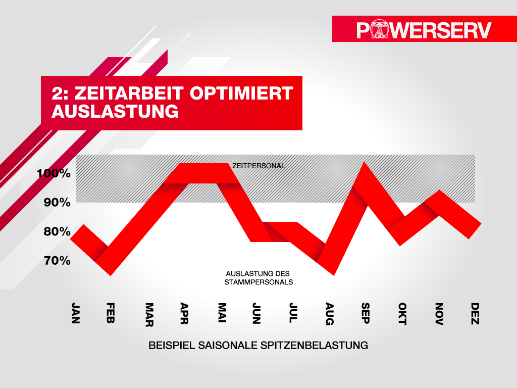
Letting images speak
There are of course numerous facts, important information and incredibly exciting details about your company that are absolutely worth sharing with the audience. But for this load of long, extensive tales and numerations, a presentation is not quite the appropriate place to do it.
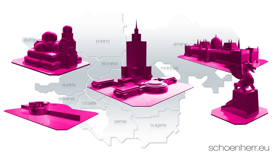
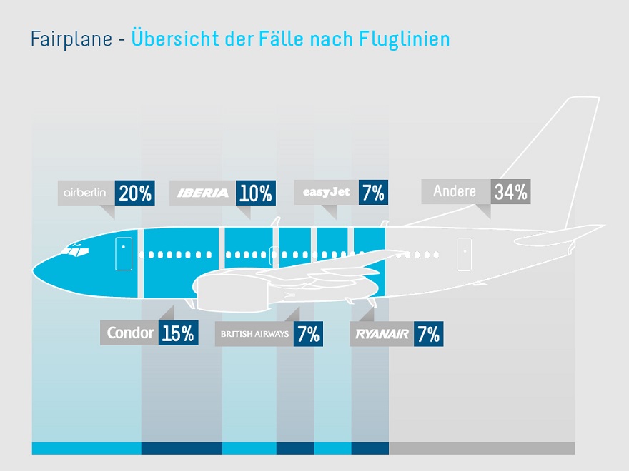
When it comes to presenting various company locations make sure to skip the tidied up list of places, contact information, and location visualization. If you desire to display store sites in a reduced manner, one approach is to make use of simple dots spread over the visually known shapes of geographical terrains. If this is still considered to be too flashy for somebody, he can add further graphical amendments to an image to then provide it with significance. The color accentuation of specific contours comes across rather lush and visualizes concrete statements.
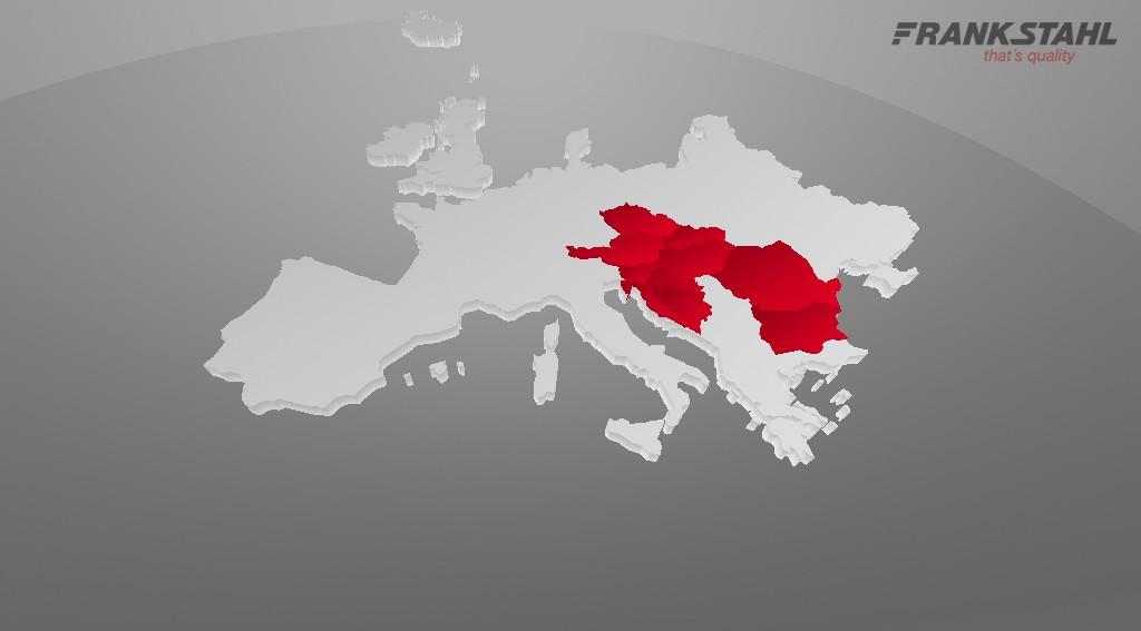
If this kind of presentation is too minimalistic, other graphical styles of representation can be used as well. In order not to spell a full country’s name - abbreviate it or depict it with the ever-identical flag. Characteristic features as such lend themselves for unique recognizability. Famous sights, architectural peculiarities or other distinct milestones allow for clear associations with a region, country or culture.
If doing specific things in a big way is on the top priority list of the agenda, then that is a requirement which must be met. With the appropriate resources in hand – if their usage bears a well-balanced proportion to the intended result - a simple presentation can become a company’s flagship project for media competence.
Using the CI
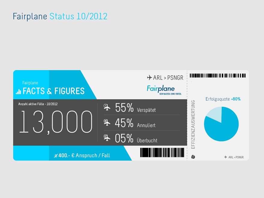
It is not for nothing that each and every company relies on – at least the basics of – a certain choice of color, symbolism, logo definitions and wordings, which are geared at being remarkable. So why not communicate this defined identity?
In efforts of using corporate colors, a graphic can become a communicative tool that is unmistakably ascribable to the company – no matter what an individual is confronted with. Not only by colors, but also by the directionality and purpose of a company, intensively high rates and optimizing visualization is of much significance.
Explaining step by step
One has to be cautious when employing complex issues into a presentation. The recipient’s cognitive resources will eventually be exhausted and his attention is drawn – if anything – to matters that are easier to comprehend.
In order to manage to still get the complex topics across, it is very useful to gradually raise the degree of details. From a more general perspective, descriptive visualizations can steadily shift to more and more precise versions – or vice versa. Thus, the recipient runs a chance to relate to the coherences and understand the dependencies of those appearances.
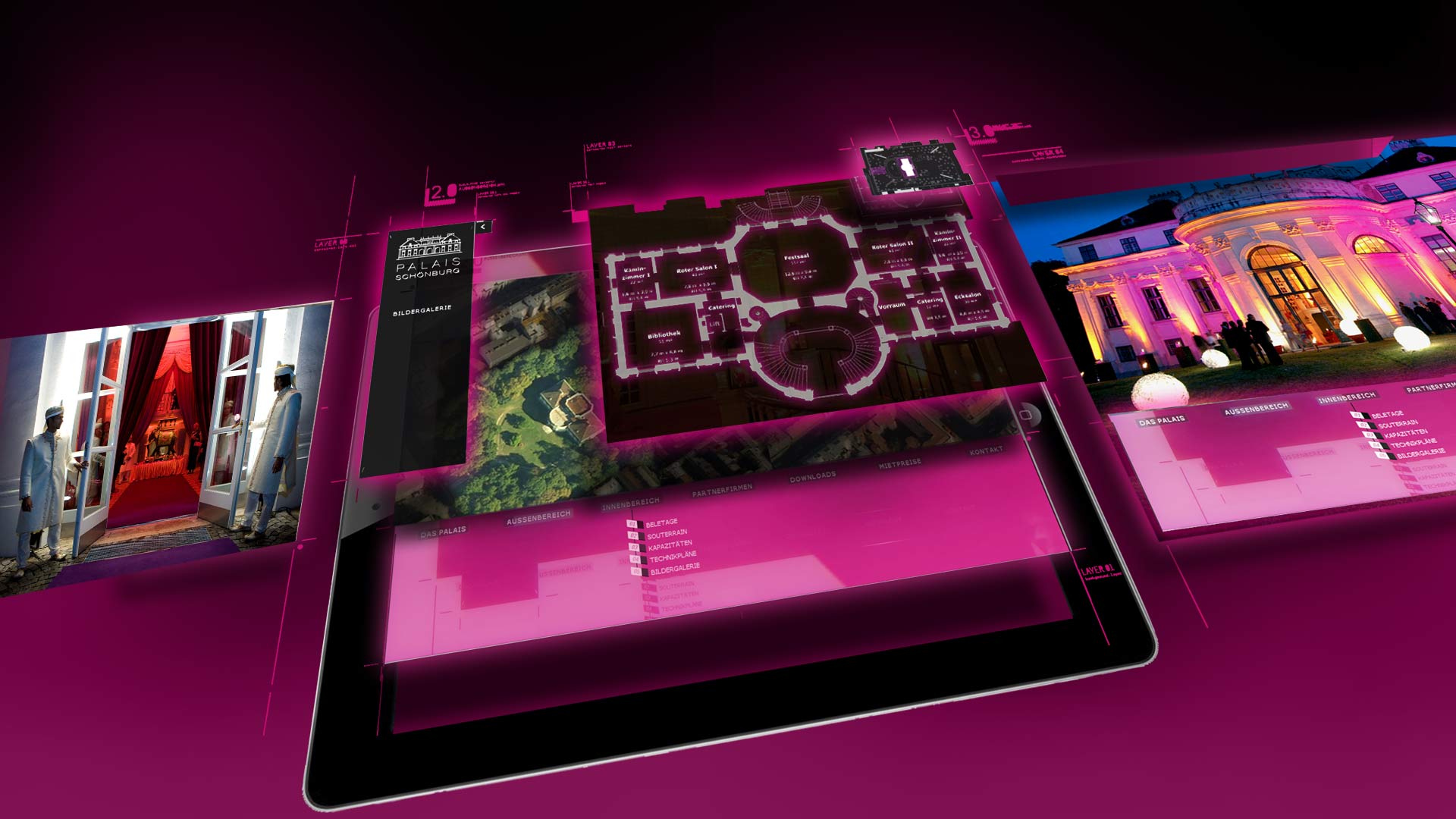
Processing purposefully
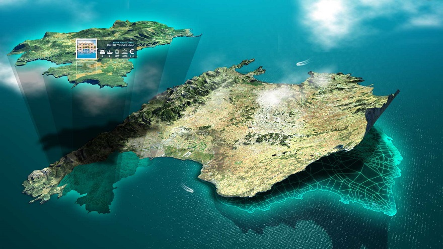
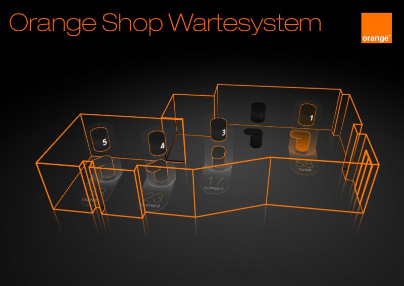
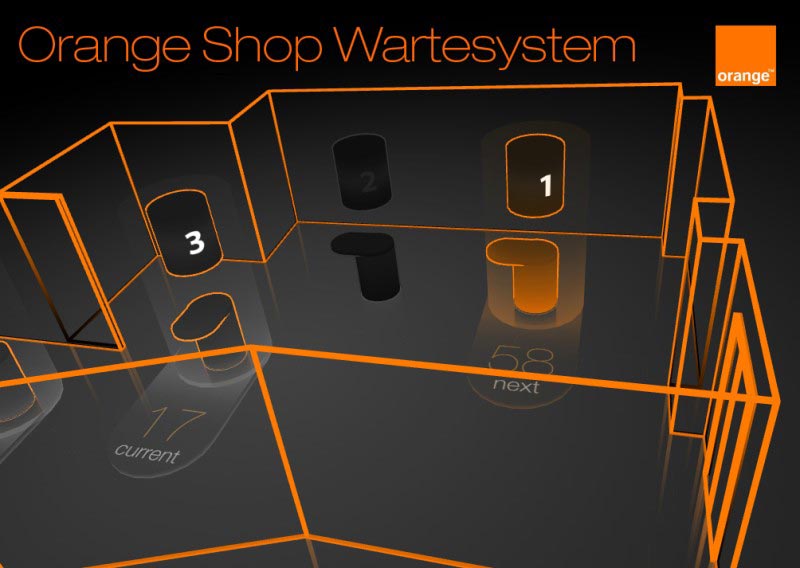
Corporate and image presentations are normally shaped with positive stimulus schemes and brim over with a good mood, happy people and carefree situations. Oftentimes it is not only possible but also helpful to break with these conventions. Architectural peculiarities, properties’ or other building illustrations are suitable for being rehashed as a 3D model.
Simultaneously to the verbal aspects, highlighting the constructional elements leads to a basis for the virtual walkthrough that could accompany the talk. By processing in 3D, the graphical counterpart is even closer to the original and conveys realistic impressions.
The skillful play with perspectives or the straight use of animations and motion, rotation or zooms - eventually shows the potential of proper preparation.
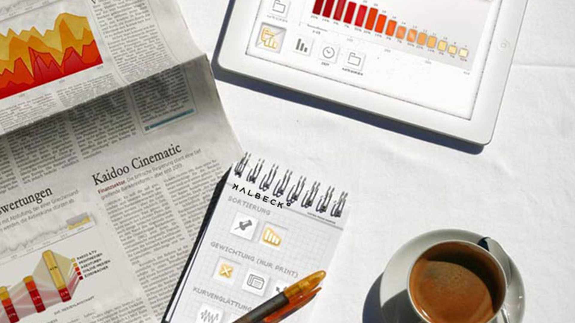
Being specific
It is not always the case that the resources last for turning a presentation into an extravaganza for all purposes. But certain kinds of details, subtleties and specific refinements can convey that special something, too, without having to invest an outstandingly high amount of time, staff, or energy. Each company possesses a focal message, a peculiar image aspect or a representative everyday item – once this is found, it can then easily be implemented into the presentation in most cases; the more subtle this takes place, the higher the surprise effect for the recipient.
What could, for example, be more representative for a recruiting company that offers tailored solutions for employers and clients than a measuring tape? For the marking of values in graphs, the measuring tape can also be applied inconspicuously but concise, and therefore transports one of the company’s core values – entirely without words.
Those who assume they have managed to use the full potential of a presentation have most likely not done so. We, too, have nowhere near arrived at the end – but while trying to, we would be pleased to take you with us.
Too long; didn't read
- Letting images speak
- Using the CI
- Explaining step by step
- Processing purposefully
- Being specific
Related Articles
kaidoo:screen Top 5
The best sites & apps
UX oriented multi platform rich media app engine.
Or something similar to that. No matter how you call it, in the end kaidoo:screen is a software that allows for web and app projects to be implemented - individually and efficiently.
This is our Top 5.
advise
Finding new approaches
We practice what we preach. kalbeck.media provides comprehensive support in the search for successful solutions between both the poles of trend and the ones of tradition.
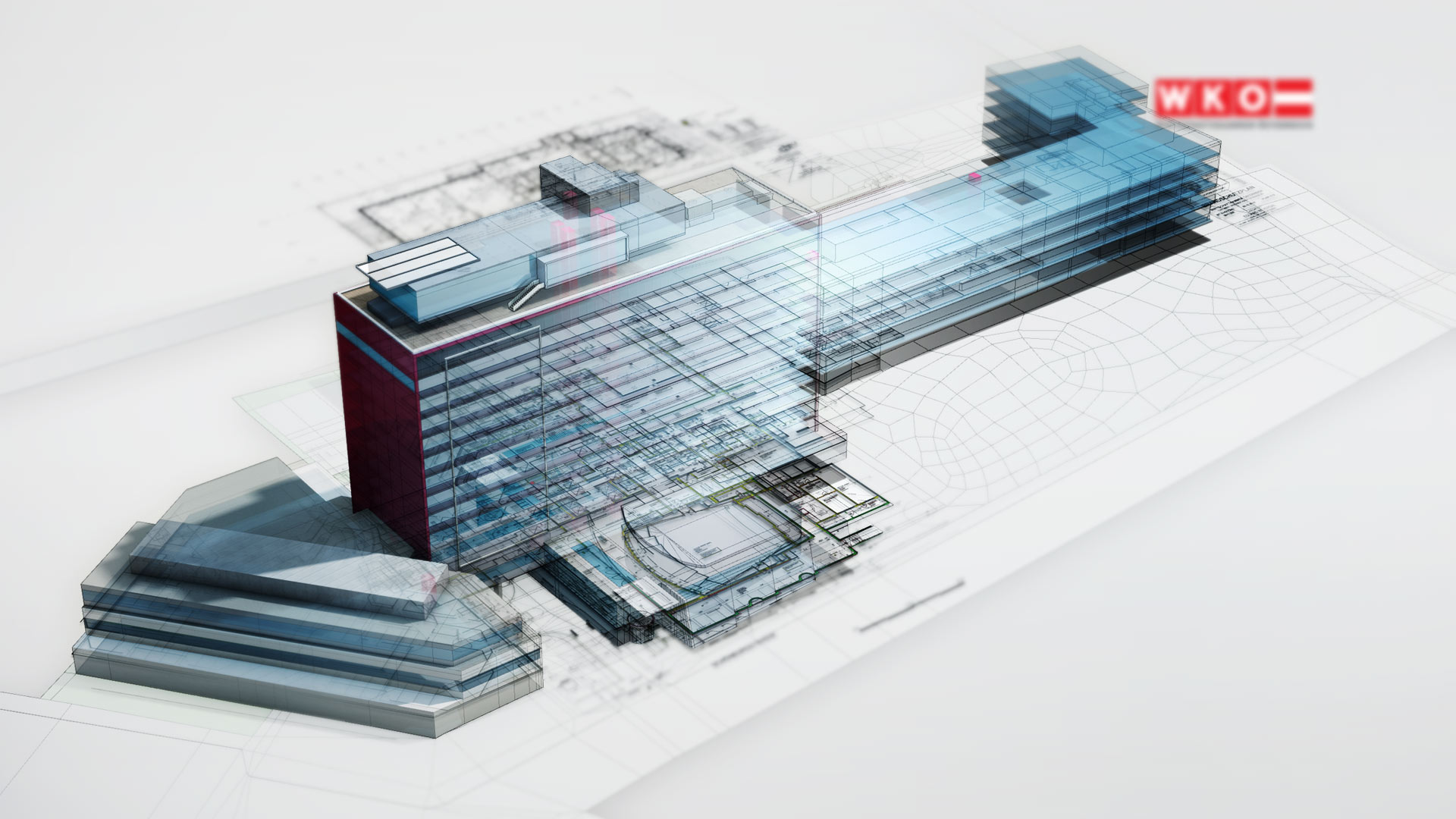
The new house of commerce
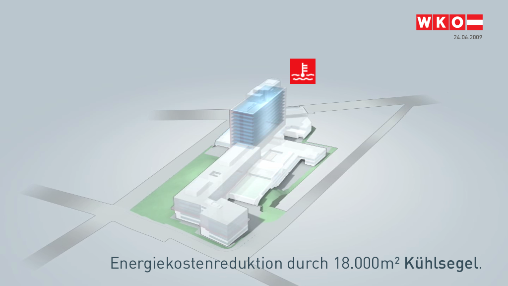
WKO - Austrian Federal Economic Chamber
Staging the new house of commerce. Presenting the results of the makeover. Explaining the beneficial characteristics.
In a video, as an app, on posters. Looks like cross-media at work.
[ 3D visualization | video | spot | app ]
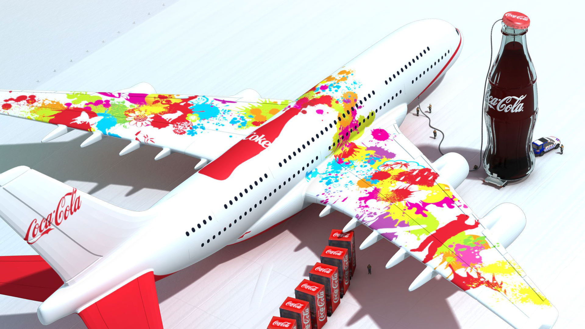
Take off to the future
Coca Cola Beverages
Employer branding and unconventional sales trainings in 3D around the slogan "take off to the future".
[ 3D information system | advise | employer branding ]