
Coca-Cola, the making of
Takeoff
tags
meta
- Length689 words 12 images
- Reading Time4 min 18 sec
- Create
Engineer
Advise80%
20%
50%
t.o.c.
Keeping up with the red/white success story of the Coca-Cola Company as one in red/white/red - the objectives of the briefing were not any less ambitious between the soft drink giant and kalbeck.media. What came from that? Pragmatic approaches in mid-air.
Increasing reach, sales, and turnover are clearly quantifiable goals pursued by nearly every brand product. But oftentimes it’s the big brands challenged by such allegedly trivial tasks that turn out to be complex issues. How and where should a brand grow if it features aided awareness of up to 100%? How can you motivate all of the stakeholders to deliver better results? And how can these economic thoughts be wrapped in a target-group-specific manner and be communicated in an appeal way?
With the main approach of redesigning the corporate strategy for sales increase of soft drinks in the Austrian market and by doing so also successfully communicating to employees and third parties about the strategy - kalbeck.media started a brainstorming process with the motto “back to the roots”: what does


Start
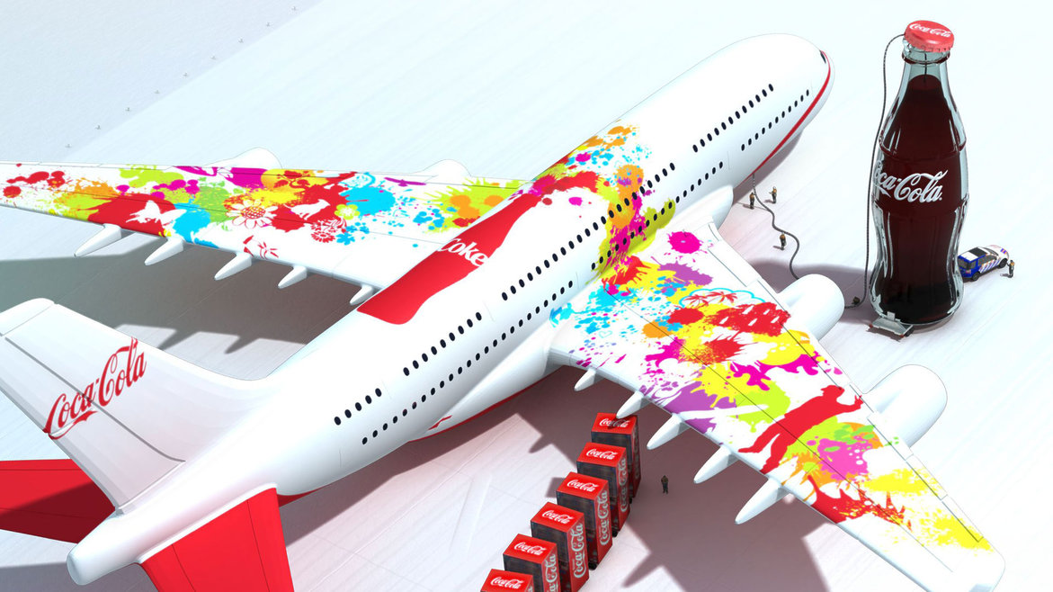
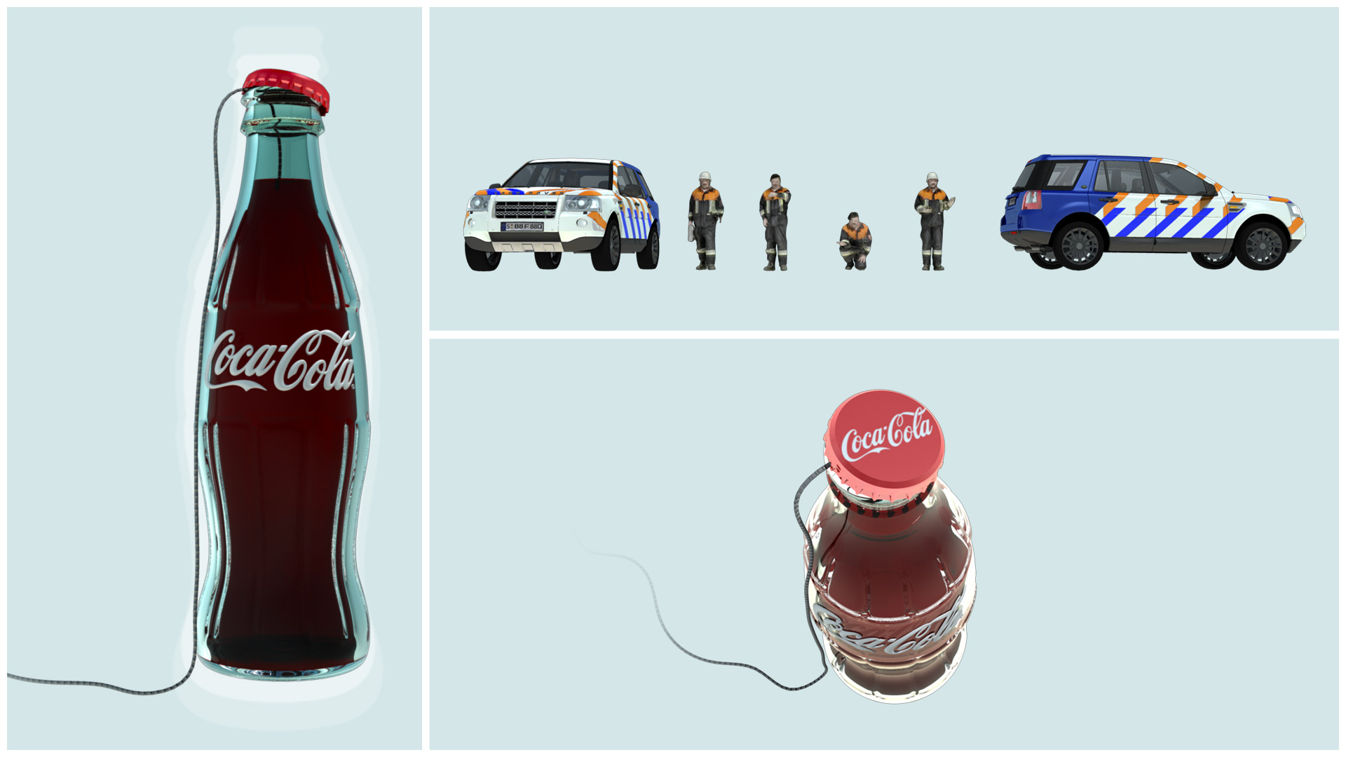
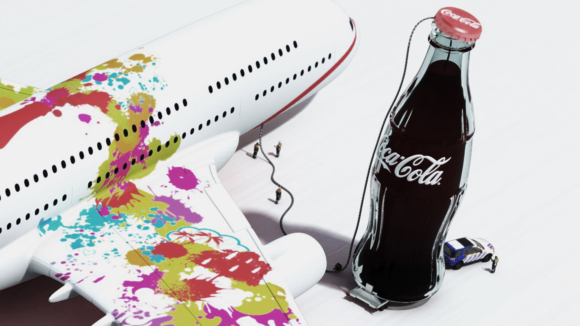
The very first scribbles got to the very core of the brand, being its visual appearance and its graphical aspects. These were implemented into a sales training later on, where Austrian sales representatives were invited from abroad. The resulting 3D presentation generated attention since its interactive renderings surprised the audience and was also fully compatible with the brand in more than just an aesthetic point of view.
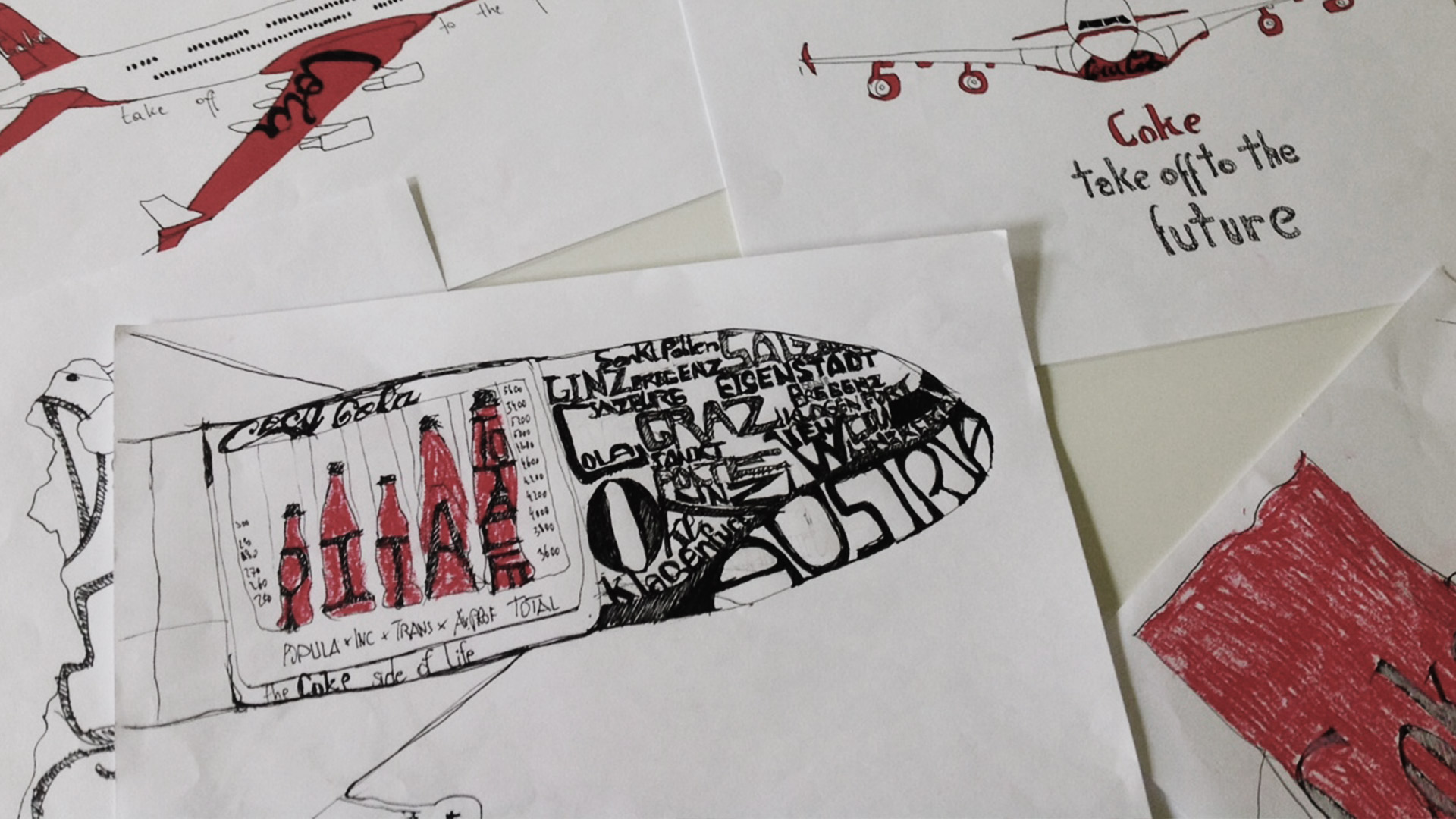
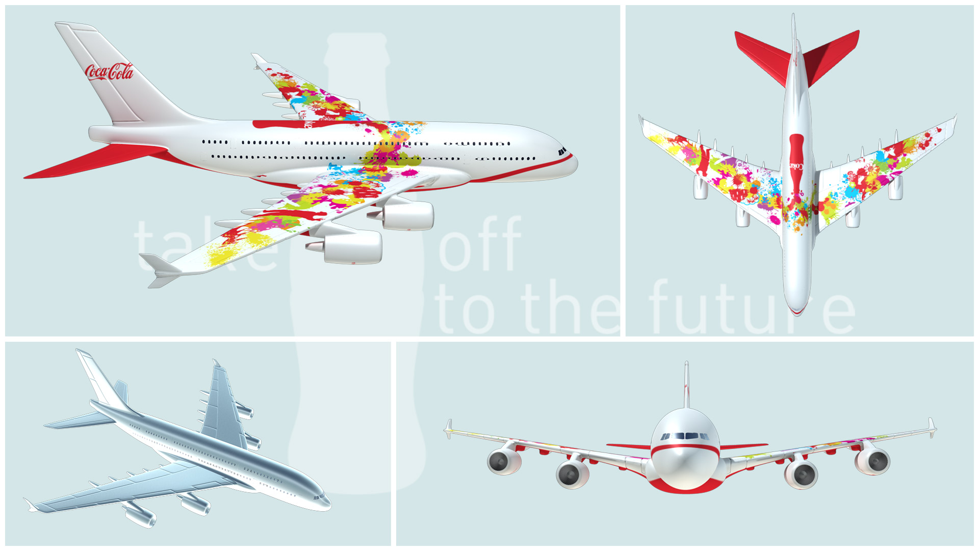
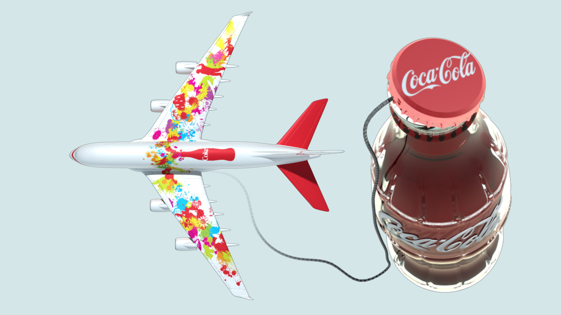
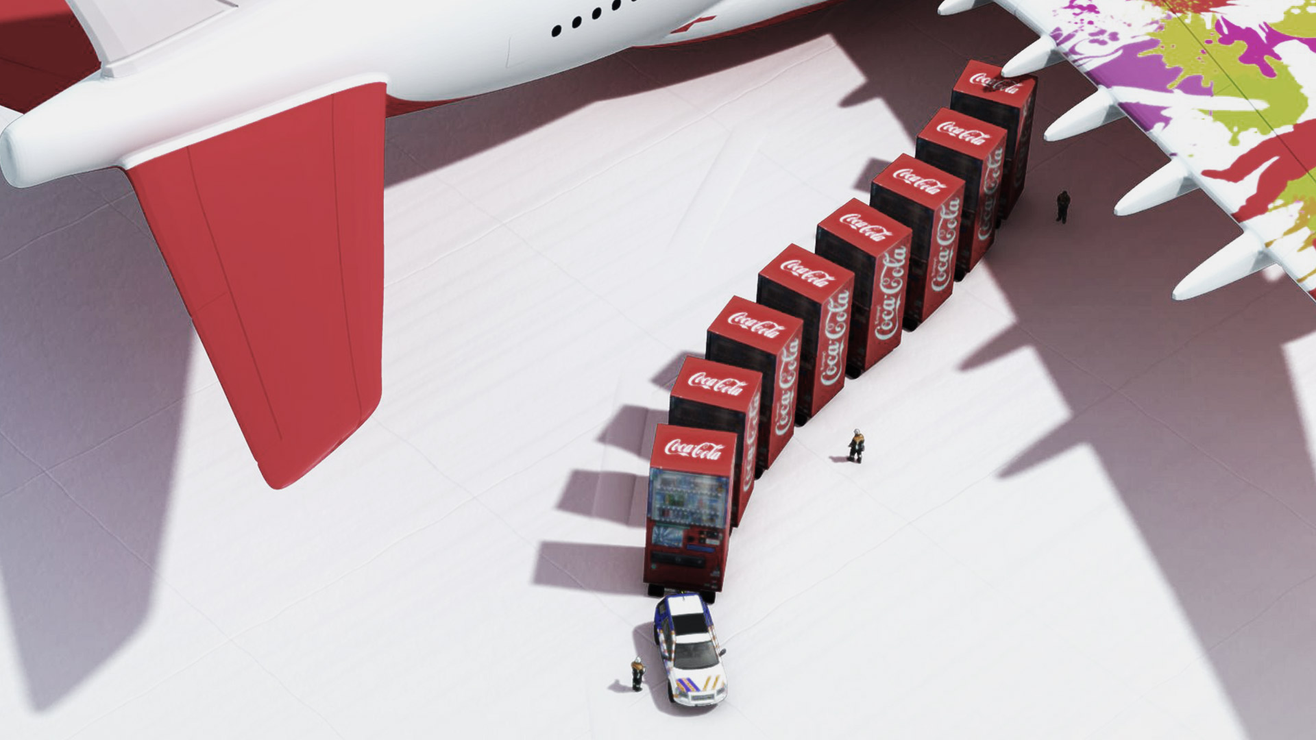
So, how could the brand start a new future in concrete terms? How could it establish the means and measures to be used for take off with Coca-Cola? This was already the answer: a fitting analogy. Taking that approach up our sleeves, the visualization was implemented in the form of a branded 3D airplane and accompanied the sales staff as they started their journey by air.
Check
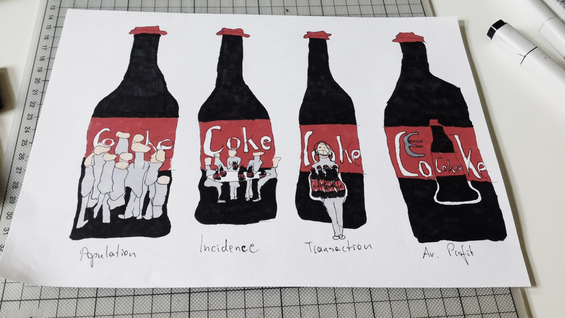
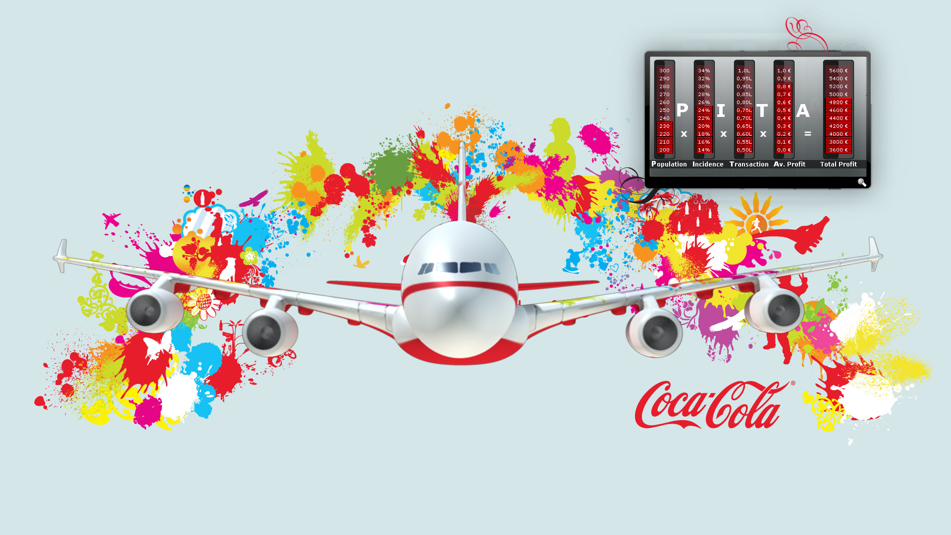
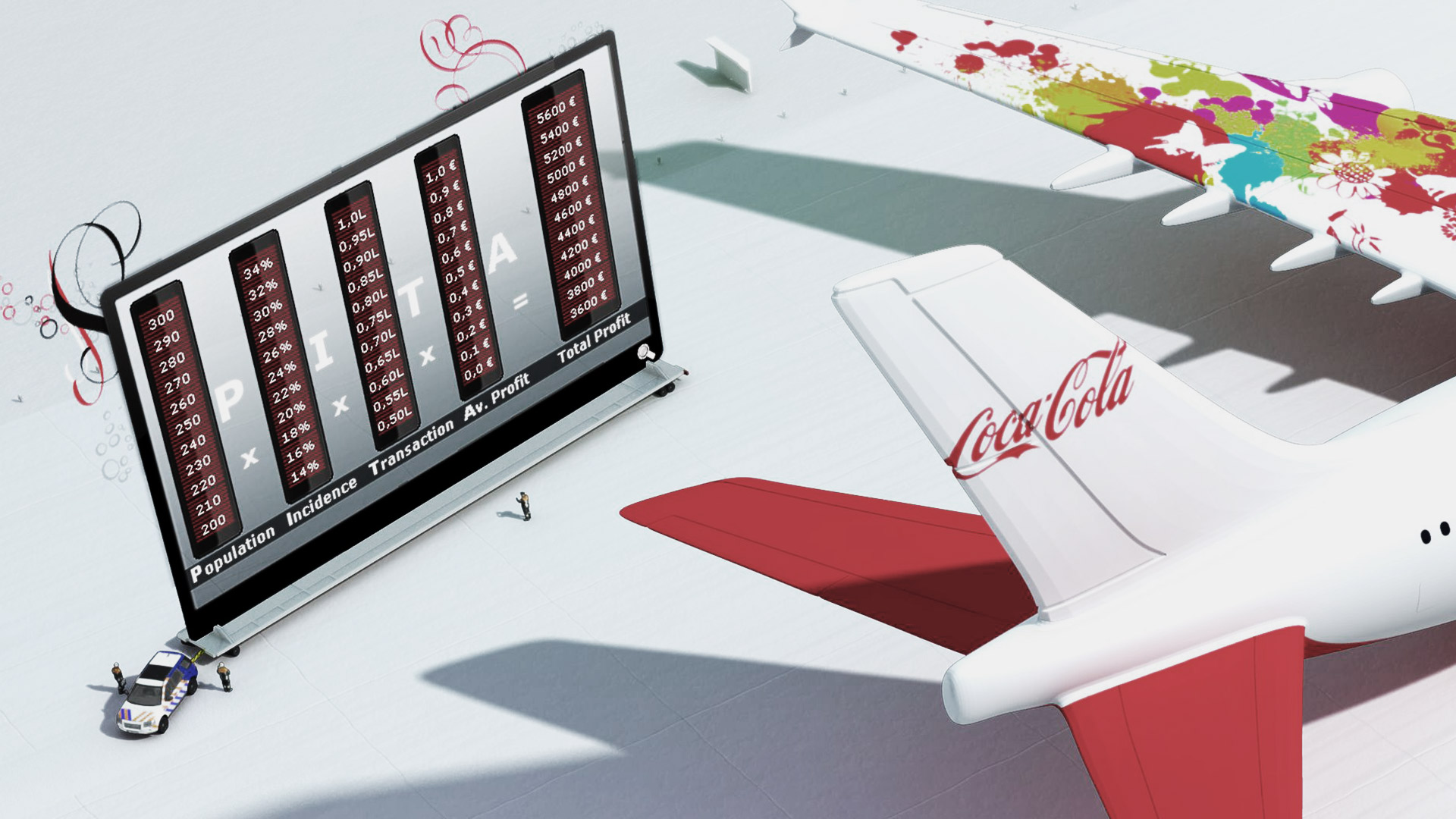
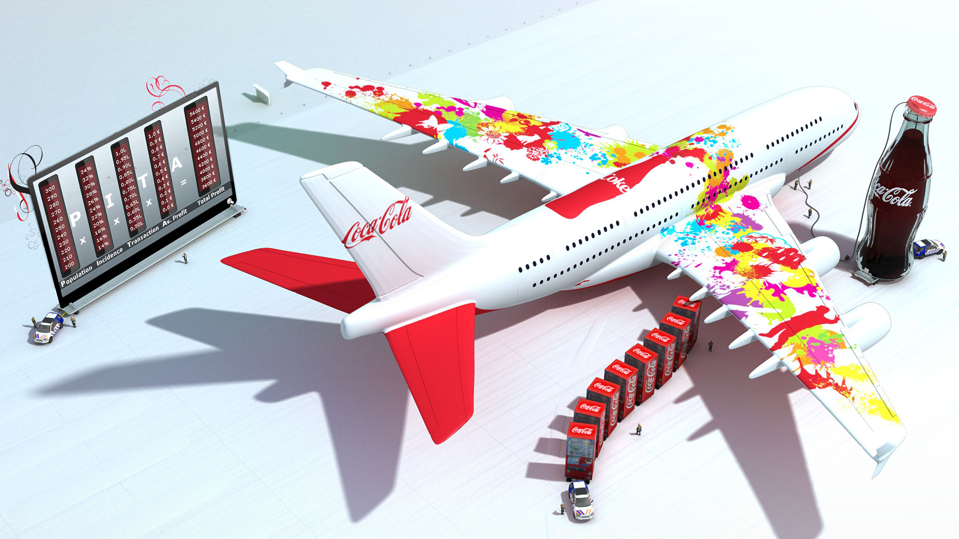
To aim for a strategic goal in an operative way the knowledge of quantifiable dimensions required the influence of the revenue gained by a company in the gastronomy industry. Therefore, the Coca-Cola Company created the formula “PITA”:
- 1. Population: How many people visit a certain premise?
- 2. Incidence: What is the percentage of people that drink Coca Cola in the premise?
- 3. Transaction: How many units are drunk on average?
- 4. Average Profit: What is the respective profit for each unit?
As it is not always about the immediate profit for every sold unit - the attention should primarily be directed to the remaining aspects. If one of those factors is raised, then this brings along an increase in total revenue. What has been well known by the management for a long time could only be transported to the sales staff as a theoretical, unworthy input mainly up to that moment; the insufficient sturdiness of thoughts turned out to be a massive difficulty in communication. With the aim of making this matter more tangible and, thus, successfully convey this over multiple levels, kalbeck.media edited the formula graphically.
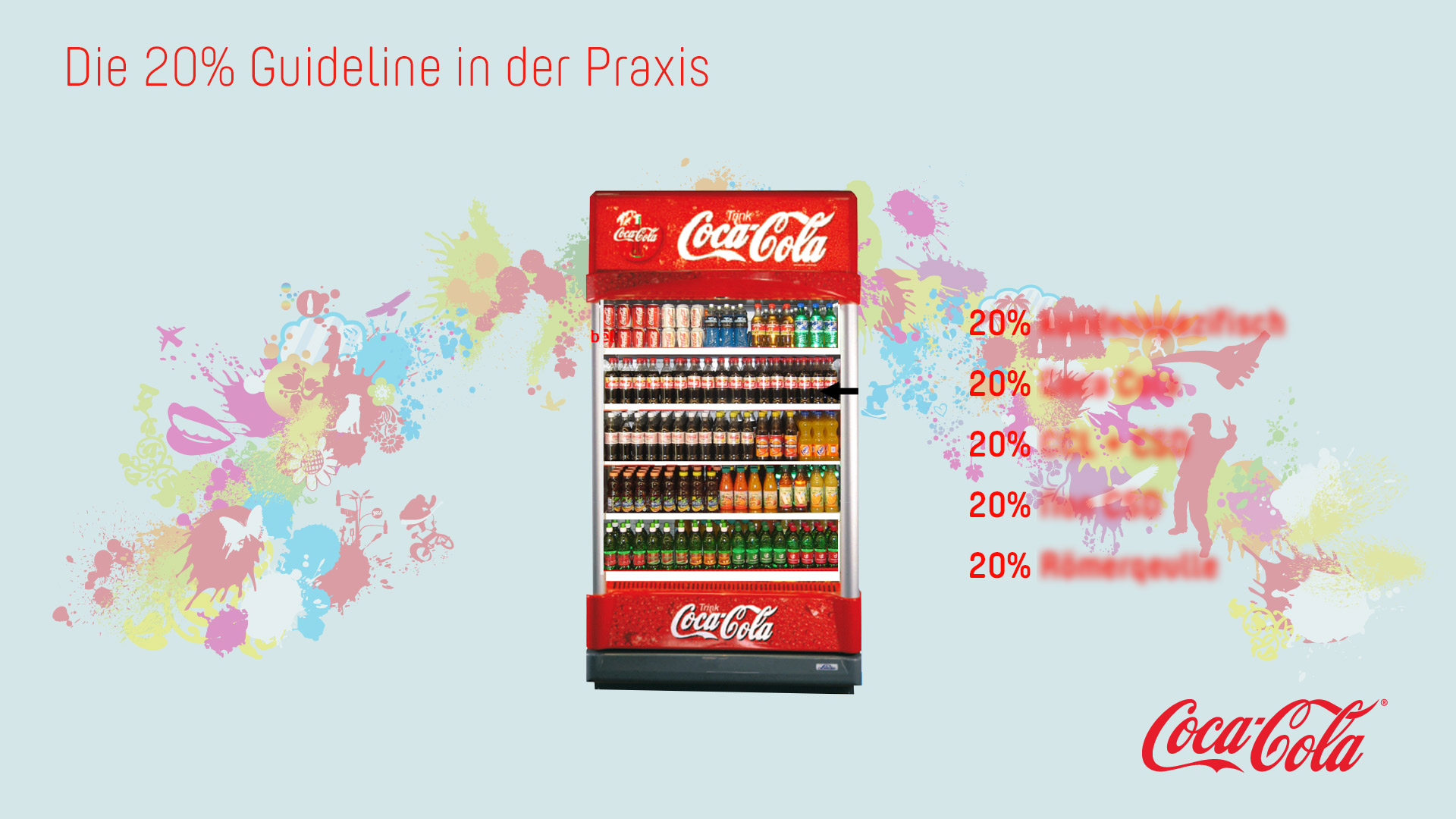
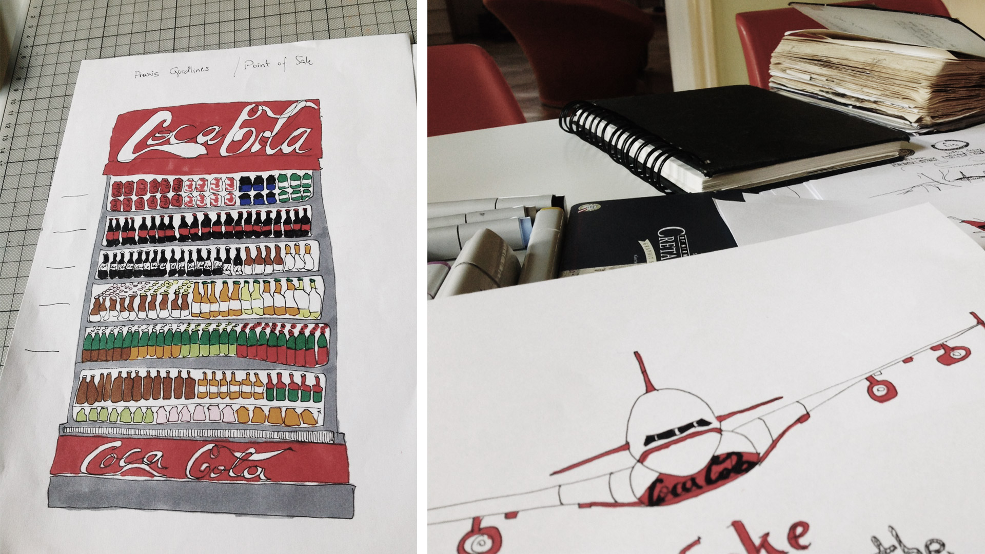
Different approaches of how to stimulate the customers’ appetite for the taste of the beverage without having to pull their leg trouser in a querulous-childlike manner can be found in several marketing books. In this industry, nothing is left to chance. Hence, the arrangement in a vending machine is planned well from the first to the last drink. It is excessively coordinated in order to adapt to the advantages and disadvantages of the stooping, viewing, and stretching zone made ideally for the content and target groups.
What used to be a basic sales guideline in the company’s headquarters, had to also be established in the staff’s daily work at various points of sale - with appropriate staging and increased awareness for small details. Identify built-in errors in the arrangement of a drinks cabinet. Through this, they could gain hands on experience in practice-oriented knowledge. This ensured successful communication from management to sales staff within the gastronomy industry and towards the actual point of sale.
The combination of internationally known branding elements and the will to support the efforts of the gastronomy, eventually called sales incentive material into play - at the immediate point of sale. Branded bar tables with optionally integrated sun umbrella systems, cooling elements, stand-up displays or simple trays were geared towards easing the running operations of premises and, simultaneously, bringing the brand to mind.
Precision landing
Presence, practical relevance, and service orientation - without having to renounce any quality attributes - got the project to not only focus on the existing guidelines and requirements of the principal, but also presented itself as output-oriented and close to reality. From the start into a new future - without leaving behind personal values.
Related Articles

Represented 1/2
Presentation No-Gos
The presentation software of personal trust might serve well - whether the result is good or not it is affected by the human component not the electronic one.

Sensible worlds of experience
Communication for all senses
Man is a sensual being. He is able to see, hear, taste and smell for his whole life. Why should advertising stop him from doing that?
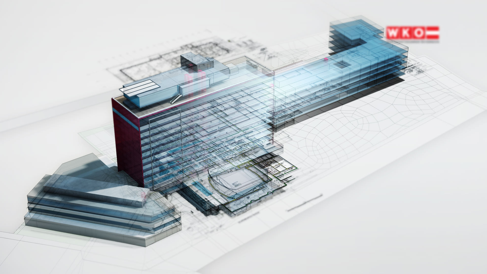
The new house of commerce
WKO - Austrian Federal Economic Chamber
Staging the new house of commerce. Presenting the results of the makeover. Explaining the beneficial characteristics.
In a video, as an app, on posters. Looks like cross-media at work.
[ 3D visualization | video | spot | app ]