

Breaking through digital standards
Against the stream
- Length1.021 words
- Reading Time3 min 24 sec
- Create
Engineer
Advise30%
40%
50%
- Introduction
- Navigation
- Icons and Symbolism
- What you get is what you see
- Link Logic
- Usability, Usability, Usability.
- Too long; didn't read
De facto standards certainly have their place when it comes to compatibility at all levels. The choice of both code languages and date formats follow general guidelines that rightly have achieved a dominant position and broad acceptance. However, this positive form of standardization is limited mainly to those areas taking place behind the curtains of the frontend and is not usually recognizable by the average user.
Nonetheless, within the areas that the user is provided insight from, a non-generic process is open for debate: confirmed by the present trend called digital customization. Template websites and pre-built features are often simply identifiable at first glance and cut across the pursuit of uniqueness.
Navigation
Lets face the reality of the fact – the classic navigation menu catches the eye of habitual patterns of execution and facilitates orientation. The main menu is situated on the top edge of the screen, the path to the accessed sub site is visible on the left, and with a quick click on the present logo one is led back to the home page. Approved formula? Certainly. An exciting one? Certainly not. Unconventional paths and options of navigation demand a larger amount of attention and cognitive resources from the user, however no later than a second time of visiting the page, the user passes through the site intuitively.
A very interesting and brave example is
 Sensi Soft (www.sensisoft.com). The spin of the advertising pillar has a respectable entertainment value and browsing through the posters has a vibrant effect due to specific methods of representation.
If you do not immediately want to throw the classic navigation menu away, then there is still plenty of room to shift it in a direction with far more aspects. Why, for example, does the navigation bar always have to be located on the left? After all, the reading direction most cultures follow are from left to right. Important information about the actual content should thus stand out at the first glance of the eye. This structure has been generally accepted by an abundant number of blog hosters as their users naturally put stronger focus on information than on the actual design. The distance covered by the mouse becomes shorter as well, as all the functionalities of the site can be found on the right side of the page. Nevertheless, this is the reason why the left-side navigation menu is still the standard for most websites - who would want their website to look like a blog template?
With credible reason, the breadcrumb path has become an increasingly essential part of websites. Displaying this trail, allows for an easier orientation on the side of the user. Therefore, there is a big difference between an SEO consulting site showing only the page’s title, “Stick to linking pages only internally, within your page” and the displaying according to breadcrumbs: Home > SEO > Tips >.
Something one should attempt to avoid.
Icons and Symbolism
A triangular arrow plays music or shows a video, a double bar stops everything again; a telephone icon is a telephone number, yet those who don’t like to talk would rather look for a letter symbol; a shopping cart indicates on this site one can spend money and a magnifying glass can be very helpful in times of cluelessness.
Just because these icons seem to be self-explanatory, there is still room for modifications. When one shops on the online store of
Nordstrom (shop.nordstrom.com), people do not use a shopping cart but rather a shopping bag – just like in real life. As an alternative to the minor modification of a shopping companion, there is also the option to individually work up established icons. Whether it is unconventional shadows or transparencies, animation or a hand drawing - the user experiences a surprise and the site appears to be far more personal. What you get is what you see
Those who promise beautiful things and are unable to uphold those promises, are the ones to lose credibility the quickest. Thus, also in web design the motto is: Shoemakers, stick to your tasks. This is ultimately what drove a U.K coder to present himself as what he is on his own site
designersfriend.co.uk (designersfriend.co.uk) Not a designer, nor a graphic artist, rather a coder: puristic, likable and convincing. The website of Gardener&Marks (www.gardenerandmarks.com.au) follows a rather similar conviction. For someone who markets their professionalism for interior design, does not need a website with the innovative features nor one that present the weather. Rather, they need a simple and consistent design, as this clearly conveys the professionalism and devotion behind his work. 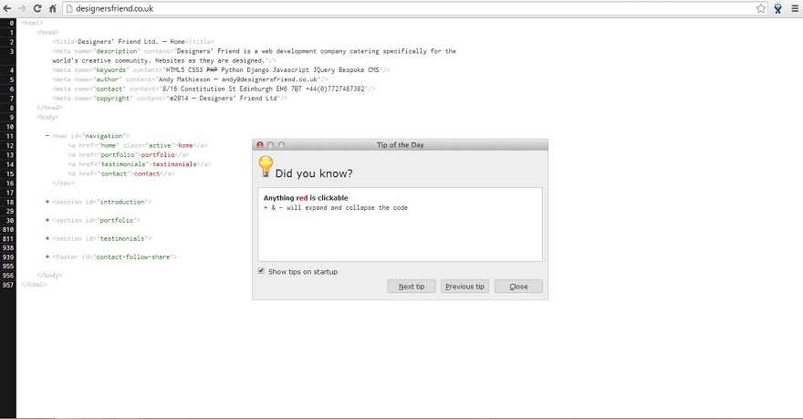
Link Logic
Text in blue indicates, “click here”, and text in dark purple indicates “no need to click because it already has been clicked”. This seems rather self-explanatory. This de facto standard has its justification as it counteracts viewing a site over and over again and through this prevents frustration on behalf of the user. The original color choice may be challenged – critics claim blue can be rather undesirable in terms of legibility. Nevertheless, experimenting within this area can lead to a large risk of massively harming usability. There is room to differ slightly from the establishment at the very least: if the link is visible due to its color, you can surely go without the underlining and the italic type.
Usability, Usability, Usability.
Firstly, considering the added value facts with potential interferences with usability is an issue that is faced in all areas. Is the user able to navigate through interestingly rehashed sites apart from standardization or is his basic objective to reach his goal in the most efficient and quickest manner? One should never underestimate the power of usability tests. They do not only reveal the effects of your usability guinea pigs, but provide feedback on the intuitiveness and attractiveness of your general page. They involve various target groups in a series of tests and make use of established procedures such as eye-tracking or time measurement.
If you begin to notice, the ease of handling has been negatively influenced in contrary to what you have expected, thus you can similarly reveal deficiencies in very concrete terms. And don’t be worried, there is always someone who does it much worse than you do.
www.theworldsworstwebsiteever.com (www.theworldsworstwebsiteever.com).
Too long; didn't read
Related Articles
Represented 2/2
Pimp my slide
The first step into using the full potential of presentations is to try and avoid making mistakes yet there is a lot more to come. In-house best practice examples demonstrate innovative and practical ways of visualization.
Living à la carte
First Mallorca Publications
Representative properties meet culinary treats. Enjoyment for all senses and tastes in the realty brochure of First Mallorca. In cooperation with gourmet chef Marc Fosh.
A fusion of the beautiful things in life, coming alive in brochures, online and during private events in a new home.
[ print | create | advise | magazine ]
kaidoo:screen Top 5
The best sites & apps
UX oriented multi platform rich media app engine.
Or something similar to that. No matter how you call it, in the end kaidoo:screen is a software that allows for web and app projects to be implemented - individually and efficiently.
This is our Top 5.