

Areas of conflict in technology communication
Facts vs. Understanding
- Length1.475 words
- Reading Time4 min 55 sec
- Create
Engineer
Advise60%
10%
40%
- Introduction
- Communication among “it is” and “it does”
- Simplification of Complexity
- Colorcoding (aka: conditioning on traffic lights)
- Size does matter
- Something nice to look at
- Conveying Competence with Checklists
- The Permission to Cheat
- Too long; didn't read
Several industries have the advantage that knowledge of rather basic issues is given in (commercial) communication. Technology as such has crossed the line a long time ago with its rather complex products and frequent innovations. It’s the technician’s job to build what most benefits the customer; but it’s not the customer’s job to understand technical coherences, problems in development or other alternative solution processes. Would it be his job then he would be a technician.
Profoundly different competences demand different things; and this is the job of communicative execution.
Communication among “it is” and “it does”
Those who create technology appreciate its features, innovations and the disruptive force of the technology. Whoever is about to apply technology wants improvement, efficiency and personal benefits. Just because the first says exactly what the second one needs, does not exactly mean that the second one understands what was first given.
As an intermediary instance, communication shows up as a translation layer and prepares data and information that is:
- Relevant
- Understandable
- Meaningful and useful for the purpose of satisfying his needs
Only when all levels of implementation and content are able to stylishly and visually be in compliance with these objects - then they convey clarity, conciseness, and the emotion behind that technology directly to the recipient.
Simplification of Complexity
It could be nice if the translation of component A goes into product B and causes product C to become obsolete and then results in more stability for product D. However, for the final consumer, who does not care for such coherences, is completely irrelevant. What matters is the final result – formulated as individual utility gain.
Therefore, graphical elements need to be simplified in order to be representations in the extent that the recipient can understand them at the first glance – or is at least convinced that he could understand them if it's expected of him. At best, pictograms and stereotypical outline drawings are sufficient, yet also complex issues appreciating such methods lead to more perceivability and overall attraction. Cycles, correlations and principles of operation might be illustrated with x-ray and wireframe structures in order to give the recipient the possibility to understand to overall concept without needing to understand the single details.
Addressing Subjectively by Relativizing Objectivity
Changing specifically between objectivity and subjectivity not only creates chances for identification but also conveys recipient-oriented competence.
Gaming manages to implement this theme in a rather exemplary manner. The alleged individual creation of a personal avatar makes the gamer feel like he could move around in a virtual world with all of its characteristics, advantages and flaws. The fact that the preset of avatar features is often rather limited is just a minor matter.
In technology communication this individualization can be made possible by applying schematic illustrations. An object is reduced to its essential characteristics to function as an object from the individual category. On purpose, it keeps to the sidelines to highlight the importance of communicating technology and its value above.
Depicting a house, for example, is not about the number of windows, the door’s location, or the floor area of the living room, rather it is mainly about the wall and the roof. Simplification and generalization works because we all try to find ourselves, objectively seen, in rather impersonal representations.
Colorcoding (aka: conditioning on traffic lights)
Certain elements that came from making our way to school safely in childhood, have greatly influenced our daily life; red:stop, green:walk. Therefore, red – as the embodiment of evil, of negatives, and of things to avoid – facilitates the intuitive orientation for validating an issue in numerous situations.
This sort of – lets call it – “color conditioning” functions as a non-verbal, even non-textual means for communication to point out grievances to the recipient and provides solutions and potentials for optimization in the same breath. Besides culturally diverging color conditionings that rest upon empiricism, it is also necessary to make use of the learned meanings within the whole range. For specific industries and products, certain colors have become increasingly prominent and attribute certain characteristics to an object solely through the coloration. Grey represents the technical and competent shade, which conveys data-oriented theory. Blue stands for infinity or coolness, black for elegance, red for luxury or intensity, and green for naturalness. Each color manages to contain certain connotations – where one is not necessarily all that unambiguous. Therefore, it is extremely crucial to evaluate.
Size does matter
Searching for the right can often mean presenting information - this can often be difficult. For the communication of complex topics and technology, posters are a good choice due to their specific size. The visual demonstration of coherences in need of explanation in particular can be worked up ideally with extensive images and generate quick (and dirty) understanding of the recipient’s mind. Even though in the long run a detailed consideration with the visualization is often preferable, the poster provides nibbles of information that pick the prospect up where he is at - depending on his state of knowledge.
Within the preparation for a poster, the previously presented aspects show up as specific guidelines: posters gather perceivability upon reduction; colors often have to transport statements intuitively; motives have to be simplified. Key stimuli shape the poster’s basic structure. Furthermore, each and every written word has to be checked content wise for its indispensability over and over again. The communication used for complexity and competence benefits mostly from the use of simplicity. Technology communication is rather bold and eye-catching. A brochure can hardly meet those requirements. Brochures are read; posters are perceived.
Something nice to look at
In an environment which is increasingly overloaded with information and stimuli, text is getting far more reduced to its sheer presence. For the sake of completeness it must not be missing, yet no one really reads it anyway. The use of images is seen as far more important – for good reason. Graphical contents are easier to assimilate and need far less explanation in comparison to text. Behavioral research, as well, confirms that we look at visual elements of communicational issue first and only then – if there’s any interest left – at the text. Images and text record take the same duration of observation in most cases – even if only one picture is used and consists of paragraphs full of text.
When using certain images, care has to be taken that they are self-explanatory and do not need subsequent text for comprehensibility. Meaningful images that call up unambiguous connotations are perfectly suitable to catch the reader’s full attention.
Conveying Competence with Checklists
Everything’s finished, everything’s there. The to-do list is worked through and the check marks are set.
Checklists have gained global fame due to their ubiquitous deployability in every condition of life. Shopping lists, to-do lists or even records of attendance – checklists have been portraying a sense of reliability and thoroughness for a long time. In a slightly modified way they are perfectly usable for communication of technology to show competence and credibility efficiently and in a visual way. The most relevant, most informative and the most innovative aspects of technological issues can be presented in checkboxes or even in simple categories. By doing this, the recipient is able to see at first glance - the device has everything it requires – or a whole lot more.
The Permission to Cheat
Facts, facts, facts… aren’t always the best choice. Sometimes it is more convenient to blend truth into the shape for the better of the recipient. What may sound like a rather bad choice in terms of business and ethics might turn out to be the right approach.
For example: an app depicts a user’s current and former power consumption with the support of a history curve. This curve has its benefits and faults yet may not be drawn unsteadily to ease the user’s process of gather information. What he doesn’t realize is that this curve has to be fabricated for that specific reason. If the actual amplitudes of energy consumption are presented in the minutest detail, then it would not only harm perception but also aesthetics in a great manor. Therefore, cheating has to be permitted – for the sake of the users. Plus: the button “show high res(oultion)” puts the actual truth in his understanding.
Technology as such is a complex topic: it requires outstandingly trained experts, specific expertise and a respectable sense for coherences and causes. Consequentially, the communication about it is barely suitable for the masses. Well, technically speaking.
Unless communication is done properly.
Too long; didn't read
Related Articles

Lifesaver
Dräger Safety
The job: saving lives.
The launch campaign for the product introduction of fire escape hoods in Austria.
[ shooting | create | print | campaign ]

Exploring casaK
R&D Project | TU Wien
Location Promotion im Highquality-Segment hat vielfältige Einsatzbereiche: Veranstaltungsplanung, Architectural Walkthroughs, Präsentation als Film- & Eventlocation, interaktive Leitsysteme, Interactive Interior Design Systems.
[ r&d | 3D information system | 3D visualisation ]
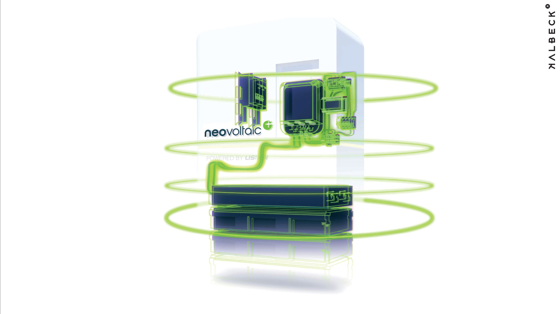
Vertical Engineering
neovoltaic AG
From the control of power electronics using client/server interfacing to the server environment and the monitoring apps: vertical engineering at work..
[ technology | advise | software engineering | backend | frontend | app | UX | online ]

Trust me!
Credibility and the web
On the internet, nobody knows you’re a dog.
On the web, delusion and disguise are masterly performed and can be difficult for users to evaluate which source is reliable. How credible is the Web after all?